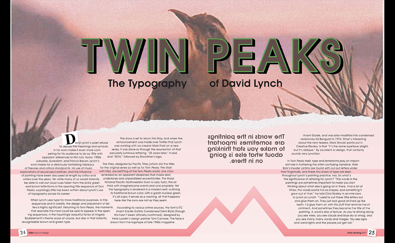
The goal of this assignment was to create a spread layout for a type-related article. The chosen article was an AIGA article about director David Lynch’s use of typography. This spread focuses on Lynch’s unusual style of surrealism, specically in his television show Twin Peaks. The heading includes the title screen for the show with its instantly recognizable brown-and-green type. The font is ITC Avant Garde Gothic, which is carried out through the rest of the spread. The body copy is arranged to follow the mountain imagery used in the show. This is inspired by Lynch’s use of words as texture and image within the article. Finally, the backwards pullquote is also a play on David Lynch’s work in reference to the iconic backwards-talking characters found in Twin Peaks.
